Tutorials
Digital Print Color Management
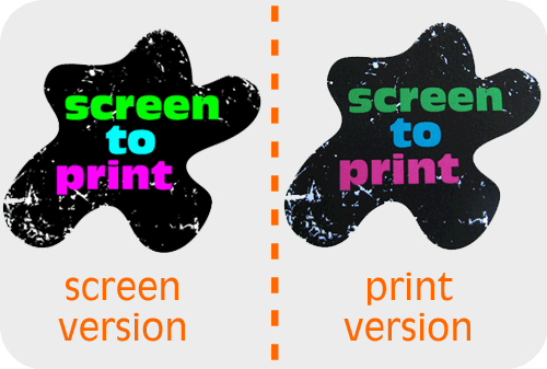
From Screen to Print
This neon green graphic looks great on my computer screen! I’m going to print it out and hang it on my wall. *Print Print* Bummer! My neon green looks like puke green in print. What happened?!
Never fear. Buttonhead is here to break down the basics of print color management for you. This article will explain the differences between screen and print color, discuss printing processes, and offer solutions on how to manage your workflow to get the best possible print color result. Please keep in mind: Color management is a vast topic, and this article is not intended to be a thorough examination. I aim only to help you understand enough to make basic decisions about your design and print processes. For an in-depth study, additional research will be required.
RGB and CMYK
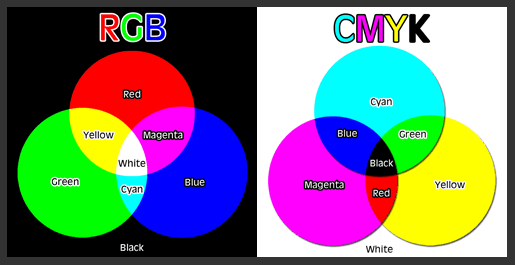
Even though computers and printers work together, individually they are two very different machines. For instance, they interpret and output color in two entirely different ways. After all, computers represent color digitally using light, while and printers use ink. Your computer uses a color system called RGB, meaning it creates color with various combinations within a Red, Green, Blue spectrum. By the way, if you are a photographer, your digital camera also uses RGB color (and so does your scanner). Your home printer, on the other hand, uses a color system called CMYK, meaning it creates color with various combinations of Cyan, Magenta, Yellow, and Black. Unfortunately for us, the range of colors within the RGB and CMYK spectrum are not the same. That neon green color looks amazing on your computer screen, but it doesn’t even exist in print.
Digital Print vs. Offset Print
In the world of printing, there are two main types of printing processes. The first and most common is digital print. Digital printing includes home inkjet printers, your office laserjet, and even those large Kinkos production printers. These printers still use CMYK ink processes, but they rely on the computer’s digital component. Digital content is rendered through a software program, such as Photoshop, and then printed onto paper via an electrical charge. Offset printing, on the other hand, uses a process similar to screenprinting. Ink is rolled onto screens and pressed against paper to recreate the original image. Colors are professionally mixed, much like house paint, via a company called Pantone. The colors are static and can be selected from swatches within the Pantone Matching System (PMS).
What is the difference between digital printing and offset printing? The two most obvious differences are price and color accuracy. Offset printing is a much more involved and precise process. With the Pantone Matching System, you are more likely to get consistent color. Consequently, it is more expensive. Digital printing is more widely available and significantly cheaper. However, digital printing, as we will discuss next, has many hard-to-control factors that can affect the outcome of your print color.
Buttonhead is a digital printer, and the remainder of this article will explore digital printing management.
Know Your Monitor
Not only are there differences in color from RGB to CMYK and from digital print to offset print, but there are also differences from computer monitor to computer monitor. Guess what? The color you see on your computer screen is not necessarily the same color I see on mine. Ugh. Can you believe that?! You may set up your digital image to look exactly how you want it and then send it to me for print, only to receive the print from me, and it’s not what you expected. Grrr! The best way to combat this is to calibrate your monitor on a regular basis.
But wait! Here is some more bad news: Even if your monitor is calibrated, there can still be inconsistencies from screen to print. Here’s an exercise: Try looking at an image on your monitor when your eyes are even with the screen. Now, tip the monitor back, and then tip it forward. Watch how the color changes. Now, adjust the brightness of your monitor, and watch how the color changes from dark to bright. Although we will be discussing all of the best ways to control certain variables, in the realm of digital images, nothing is 100% fool proof.
Color Is Relative
Let’s just take a brief moment to discuss relative color. Take a look at the image below. The two squares in the center look like two different shades of blue, right? It’s actually the exact same blue being affected by the color surrounding it. When designing graphics, it’s important to keep in mind that colors interact with each other. Where a certain color appears in your design may affect how that color is perceived.
Similarly, color is affected by light. Here is another exercise: Print an image and look at it under a lamp in your home and observe the color. Then, step out into the daylight and see how that color changes. Your house lamp most likely has a warm light, while daylight tends to cast blue. The color cast of light will change how your print colors are perceived.

Controlling Color Through Color Space
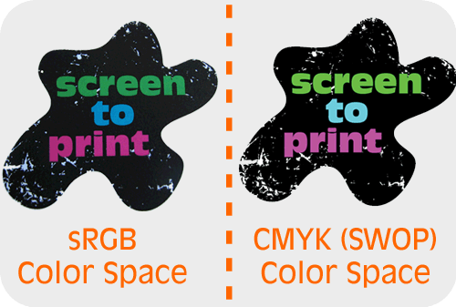
Now that we’ve discussed all of the many x factors that can affect digital print color, let’s start talking about the ways we can best manage the situation. The first and most important is to become familiar with color space. Simply put, color space is a map of colors that can possibly be represented by a device. For instance, a CMYK color space is a map that represents all possible CMYK colors. An RGB color space is a map that represents all possible RGB colors. When creating a new graphic or manipulating a current graphic in a software program, such as Photoshop, Corel, or Illustrator, you have the option of working in a particular color space to contain and represent the types of colors used. The most common color spaces for designers are: CMYK (SWOP), sRGB, or Adobe RGB. The color space you choose to create/edit your graphic in will yield two different results when printed digitally.
What Color Space Should I Use?
An image designed and printed in a CMYK color space may look drastically different than that same image designed and printed in an RGB color space. So, what color space should you use? The answer will depend on the final output of your project.
Here is a very basic formula that will help you determine which to use:
RGB: For Digital printing and Web
CMYK: For Offset printing
Are there exceptions to this rule? Yes, of course! However, this is a pretty good rule of thumb.
Color Space Conversion and Consistency
Wait a minute. Even though my home printer uses CMYK ink, I should still edit my photo in an RGB color space? Yes! The reason is this: Whether you create the image in RGB or CMYK, your monitor will always show you RGB colors. Remember, a digital printer relies on your computer’s digital component. Your printer is designed to translate those colors to a CMYK color model. Design and edit your images in RGB, and let your editing software and printer work together to convert the colors for you. The more converting you do, the more possible color loss you may experience. You can manually convert the color space within your image editing program, but you should do so with care.
Whichever color space you choose, it’s important to remain consistent from creation to print. When you convert from one to another, the color information from the original file becomes lost. If you are designing an image for offset print, use CMYK from start to finish. If you are designing an image for digital print, choose an RGB color space, stick with it, and ensure that your printer uses that color space as well. Converting the space is helpful at times, but remember that color can easily become lost in translation.
Soft Proofing
The best way to avoid the headache of color matching is to use a process called soft proofing. Soft proofing is a built-in process within your editing software that shows (roughly) how your image will look when printed. It’s like printing without printing! In Photoshop, for instance, you can select View > Proof Colors, and you will see a working preview of how your colors will translate to print. Depending on the type of editing software you use, I strongly recommend discovering your soft proofing tools. It will not only save you the headache, but it will save you ink as well.
Keep Coloring!
I hope this article has helped give you a basic understanding of digital color management. Print color is a incredibly deep topic that goes beyond my space here and my expertise. Any of these individual topics can be further researched to provide you with a huge amount of additional information. I recommend just focusing on the basics at first, then do more research as issue arise, questions form, or curiosity leads. Just keep designing, printing, and learning!